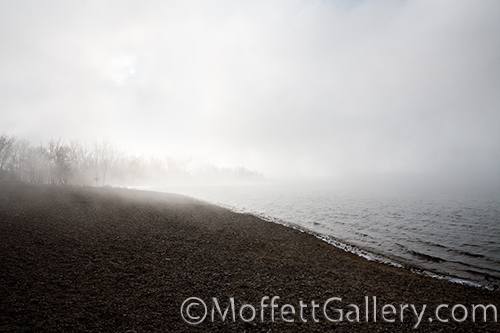
Combining the concept of simplicity and the design element of line in landscape photography is sometimes difficult for new photographers to grasp hold of. Often, I find students using line in predominantly “busy” images, which is just the opposite of simple. I love combining these two because when done successfully you end up with a very calm, peaceful image that has good flow or creates good eye movement throughout the photograph, as with the image above.
Recent Posts
Archives
Categories
Silent Solitude


Recent Comments