by tmoffett | Jul 17, 2010 | Black and White, Landscape, Photographic Philosophy
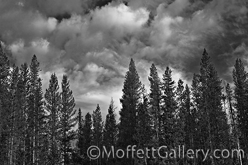
Cloudy Skies
I love the edges. The edge of the light. The edge of situations. The edge of a storm. It seems that everything is more exciting on the edge. Buried in the center is predictability. The light becomes lifeless. The storm is dark and wet. On the edge of a storm you will find clouds that are lively and exciting.
This image was made a couple of years ago and I haven’t been to excited about it. I finally, after passing over it numerous times, decided to print a small print. I do that as I prep images to see the progress and make sure everything is perfect before doing the final, master print. When the 7×10 came out of the printer my heart immediately jumped! the clouds popped and I was hooked. This image definitely has potential. It still needs a bit of work, but it will get there. My process for getting to the master print is a long one. I have in my minds eye a good idea as to what the print will look like when I shoot it. However, I tweak the image and refine it over a period of time until it is just right. Sometimes this takes hours, sometimes days and sometimes weeks. It just depends on the image. But when it is finished, it is just right. It will have a feel to it that sens a message to the viewer and hopefully let them feel what I felt when it was created.
by tmoffett | Jul 15, 2010 | Black and White, Composition, Landscape
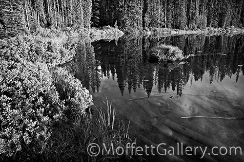
Reflections, Martin Lake
Martin Lake is a favorite destination for a couple of my boys. The morning air is crisp and cool and the lake is generally crystal clear. The fishing is usually quite good as well.
One morning I headed to the lake at sunrise with my camera instead of fishing rod. The early light was just right to highlight the foliage along the shoreline, and the calm water reflected an image of the trees across the way as if it were a mirror. I walked around the lake until I found a location to isolate the mound of grass highlighted by the morning sun against the dark reflection of the trees. I could see the reflection of the clouds on the surface of the water, while at the same time see the fallen trees at the bottom of the lake. It was a wonderful view.
What makes it work? Effective use of leading lines and framing concepts move the eye around the image. The mound of grass gives the eye a resting place before moving through the photograph again.
by tmoffett | Jul 14, 2010 | Black and White, Composition, Critique, Landscape, Photo tips
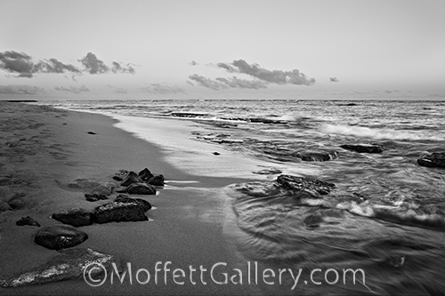
Kapaa Shoreline
Now that we all shoot digital cameras, I think many have forgotten that black and white is even an option. We are shooting color because that is what the camera does. We shoot color for colors sake, and often forget about light quality and tonal range of the image that we are creating. Often, I see images where the color actually gets in the way of the photograph. Toss out the color and the image improves. The photograph above is just such an example, in color, it was very busy. Yellows and reds on the beach, pink and blue in the sky, greens and blues in the water. The placement of the colors just didn’t work, but the tones of the scene were very nice. Learning to see the tones instead of the color is what will make a great black and white photographer.
Shooting for black and white is an art in and of itself that when mastered will dramatically improve your color photography as well. In order for an image to be good in black and white we must look at the tones of the scene. How light is the lightest area and how dark is the darkest area. Morning and evening light, often referred to as the sweet light or the golden hour, give us a reduced contrast and softer light so that detail can be maintained in both highlight and shadow. These are the times of day when I do most of my serious photographing. The light is exciting and most anything will look good.
This image was shot just prior to sunset on the beach in Kauai. The light skimmed across the waves so as to create very nice highlights in the moving water, yet allowed the shadow areas to go dark and rich while still maintaining some detail. Also, as I discussed yesterday, the rule of thirds is used here. I was not consciously thinking about it, but having developed an eye for composition, it just happens. Notice when a grid is placed over the photograph, where the intersecting points fall. 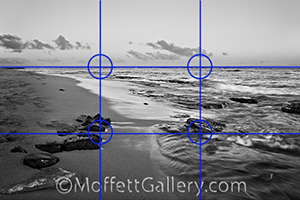 On the rocks to the left, the reef on the right and also the horizon line is on the top horizontal grid line.
Practice shooting black and white and apply the principles of composition and watch your photographs improve!
by tmoffett | Jul 13, 2010 | Black and White, Composition, Landscape, Photographic Philosophy
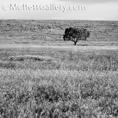
Isolation, Cassia County, Idaho
Composition in landscape photography is sometimes a touchy subject, but in my opinion is very critical to discuss. Some see good composition naturally… it is a gift they have, others must learn to see. Neither way is necessarily better than the other, just different ways of seeing. I often hear that “rules were meant to be broken.” Yes, but I also once heard that “knowing the rules and intentionally breaking them is the difference between art and accident.” We must understand and recognize good compositional design.
The first basic rule of composition that I each is the Rule of Thirds. It is a simplified derivation of the Golden Mean. This basic rule will do more to improve your photography than any other rule of composition. In a nutshell, what it states is that if you divide your frame into thirds both horizontally and vertically, the strongest points to place the main subject matter is on one of the intersecting points. Basically, avoid centering the subject. At first this may seem odd, and sometimes difficult as you must also maintain visual balance, but as you practice and develop an eye for better composition, it will become very natural.
In this image, if we were to overlay a grid dividing the photograph into thirds, you would find that the intersection of the top and right third lines is right over the tree. There are some other compositional elements at play in this image that help it as well, but the main one is the Rule of Thirds.
Oftentimes we get in such a hurry to get the shot that we forget to really scrutinize what is in the viewfinder. Slowing down and checking every square millimeter of the viewfinder will help us to eliminate everything that distracts from the subject, thus allowing a more simple and powerful image. It is my philosophy that slowing down will allow me to get one really great photo, which is much better than coming home with ten mediocre images.
Slow down, check and recheck the viewfinder and apply the rule of thirds and you will notice drastic improvements in your images.
by tmoffett | Jul 12, 2010 | Color, Composition, Critique, Landscape
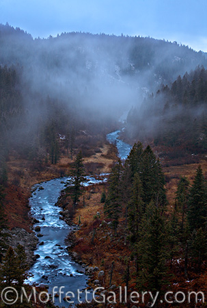
Warm River
A few days ago I posted Tunnel Vision. This is a view the other direction. A beautiful view overlooking Warm River. This is another image that seems to have grown on me. Originally I was not real fond of the image, but over time it has become a favorite. The low-resolution internet version does not do it justice. You really need to see the print in person.
The fog began moving in the canyon as the light diminished and became quite a remarkable sight. The blue from the sky became the light source and created an interesting, almost surreal palette to the scene. The long exposure (20 seconds) created a soft, smooth flow of the river wandering through the image from left to right. The blue of the sky reflected off the water and nicely contrasts with the reds and yellows of the fall foliage along its banks. Everything seemed to work out just right, and I happen to be in a place at the right time to create the photograph. Timing is everything in landscape photography.
by tmoffett | Jul 10, 2010 | Color, Landscape, Photographic Philosophy
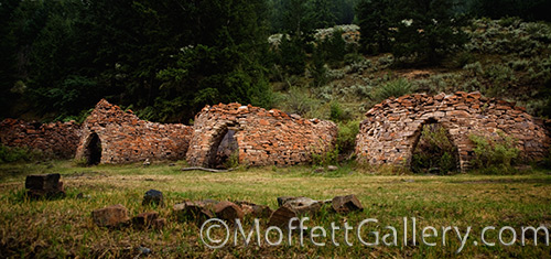
Abandoned Kilns
As a landscape photographer, I don’t find myself drawn to structures very often, however on a trip to the old ghost town of Bayhorse, Idaho, we passed these old abandoned kilns and I had to stop. I have since thought about why I needed to stop. What is it about ghost towns that we are drawn to?
Bayhorse was a booming mining town in the 1880’s and 1890’s. these kilns, along with 3 others are where charcoal was made to fuel the smelters. I can imagine these in full operation. It was a very busy place. And now, nothing. Empty. Only a figment of our imaginations.
It is amazing to me how a place can be so full of life one day, and totally deserted the next. The emptiness is what I felt as I pondered what I was photographing. That is what I wanted to portray. I think it shows. I know I feel it again when I view the image. The soft light coming from an overcast sky helps create the feeling, as well as the darker, moodier interpretation of the final print. The rocks in the foreground also enhance the feeling of abandonment and decay. I hope you can feel it as I do.



Recent Comments