by tmoffett | Oct 27, 2010 | Color, Landscape, Ramblings
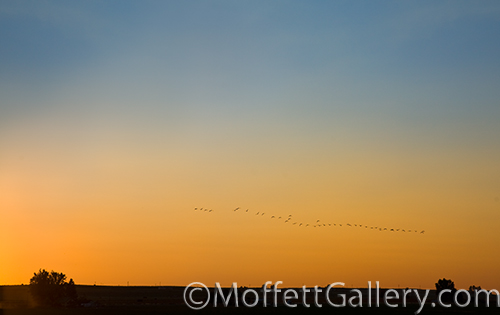
Twilight
October is my favorite month to photograph. The air is cool and refreshing. The colors are great and the light is wonderful. There is a good mixture of sunny days and stormy weather… I love both! Above all, though, the sunsets are usually great.
One particular evening as I was out at the lake, I turned west just in time to see this line of birds crossing through the golden light after the sun had dropped below the horizon. I quickly turned the camera and shot. I didn’t have time to think, I just did it. I was glad to have had enough experience to know where my camera settings needed to be because I only got one frame shot and the birds were gone. It is so important to understand the technical aspects of the camera so that you don’t miss out on these kind of opportunities.
by tmoffett | Oct 26, 2010 | Color, Landscape
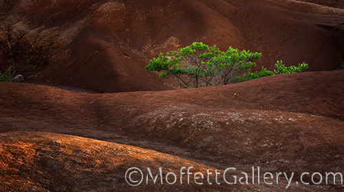
Light is what I look for. If I find great light, I will always find a subject. In this case a small stand of trees in the middle of the red rock hillside on the island of Kauai. I noticed this on the way up to Waimea Canyon, but on the way back down at sunset the light was just right. It skims across the tree as well as the ridges of the rolling hills and creates depth in the image otherwise unattainable. The light dances across the scene creating a liveliness that was not there just a few hours earlier. Timing is everything. A photographer must be patient if he is to succeed. It is a life of looking and waiting, then at just the right instant creating. It is a wonderful life!
by tmoffett | Oct 25, 2010 | Color, Composition, Landscape, Ramblings
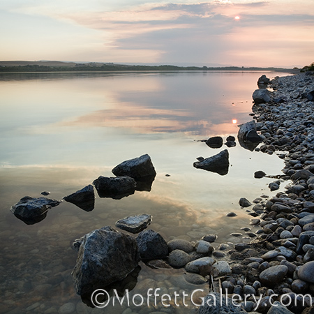
Sunset, Gotts Point
I used to shoot square images a lot. My wedding camera, back in the days of film, was square. I sometimes miss that Bronica. I liked the feel of it. I liked the format. It was refreshing because it was different. It was sometimes challenging to shoot interesting compositions because it was symmetrical. I got used to it and loved it. Now I shoot almost entirely digital. I have one format. Occasionally I still see square, though, and I shoot and crop. This is one such image.
While out at the lake earlier this month, I watched the sun setting and this pastel image appeared before my eyes. I set up my tripod and camera, and rotated from horizontal to vertical and back again. The image was not in the rectangle frame of my DSLR. It was most definitely square. The lines created by the rocks and the horizon leading left to right are strong. The placement of the sun in the upper right, perfect. This is the perfect composition to be photographed square. It has a strong vertical feel to it, yet it is perfectly square. My mind drifted back to my Bronica SQai. I could feel it in my hands as I squeezed the shutter. Even the color of the image is reminiscent of the color from Kodak VPS, my favorite color film that Kodak ever made. The pastel colors rendered warm and inviting. The contrast soft and smooth. This image reminds me a lot of my days shooting film. Those were good days.
by tmoffett | Oct 22, 2010 | Color, Landscape, Photographic Philosophy
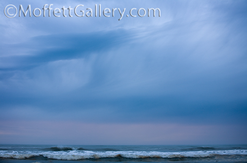
Stormy Sunset, Seaside Oregon
Simplicity in an image brings power. This is a hard concept for beginning photographers to grasp. In our complex lives it is hard to cut out the clutter in our minds and recognize the simple things that are so beautiful. This goes not only for image making, but for our lives as well. Because multitasking is normal, our minds have a difficult time slowing down, if even for a moment. While difficult to do, it has become a necessity for me. I take time to ponder and meditate, to not only look but truly see, not just touch but feel my environment. As I take time to absorb my surroundings I am better able to reduce a scene, visually, to its foundation which is where its beauty lies. Only then am I able to capture it simply and emotionally.
My process when photographing is not fast. It is slow and thoughtful. Often I will set up my tripod and camera and then look and think and ponder. “What drew me into the scene?” “Why did I set up my camera here?” These and numerous other questions go through my mind as I determine what it is that the image is to be about. Then I check the viewfinder and check it again, set exposure settings and check the viewfinder again. Eventually I press the shutter. The entire process is an experience. The whole experience becomes the photograph, an image that hopefully can be felt by the viewer, but if not, it is experienced by me and I am satisfied.
by tmoffett | Oct 20, 2010 | Black and White, Composition, Landscape
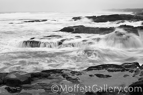
Oregon Shoreline
This image from the Shorelines Portfolio shows a stark contrast from the calm image that I posted yesterday. Using a faster shutter speed, I was able to maintain a greater feeling of turbulence in the ocean as the waves crash into the rock outcroppings along the shore. When photographing moving water, shutter speed selection is critical. Use a very slow shutter speed and all of the motion is smoothed out, sometimes to the extent of being mushy and washed out, lacking detail. Too fast of a shutter speed and every drop of water is frozen in space. The in between shutter speeds are what I usually work with, getting a perfect blend of detail and movement.
I had been to this location before at high tide, so arriving in the dark just prior to low tide this time, I had no idea what I might find. I was not disappointed. As the sun crept over the horizon, I found many tide pools filled with sea stars and other ocean life. I also found this composition waiting to be photographed. I love the still water reflecting the overcast sky on the dark rock in the foreground with the turbulence of a raging sea behind it. The image, to me, is all about turbulence in life and finding peace as we rise above it. Hindsight is 20/20. When rising above the trial, we look back and can see the beauty of where we have passed.
by tmoffett | Oct 19, 2010 | Black and White, Composition, Landscape
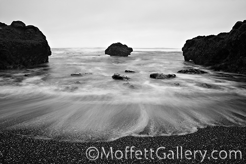
Floating Rock, Yachats, Oregon
Dead Center. A colleague of mine was given this nickname in college because she loved symmetrical compositions. The main subject always in dead center. I dedicate this image to her.
I am always teaching and preaching the Rule of Thirds and the Golden Mean. If my students learn nothing else about composition, they better know understand those. So why do I occasionally not use them? Because it works! When deviating from a tried and true technique, such as the Rule of Thirds, there better be a reason for it. In this image, there is. The outcropping rock on each side of center appear to point to the center rock and then the water coming forward breaks up the composition enough to add interest and direction. The edge of the water in the foreground give a defining edge that completes a circular composition, giving the viewers eye a place to go, preventing it from stagnating in the center of the image as so many dead center compositions do.
I love off center compositions that maintain a visual balance, however it is good to break it up once in a while and do something different. Just make sure there is a reason for it and that it works visually. Like I tell my students, “Rules were meant to be broken, but you better have a reason for it!”


Recent Comments